Point of Sale Software

Here are some Articles from the Blog Subject - Sales data visualization -

How to Turn a PosBrowser PDF Report Into an AI Dashboard in Minutes

POS SOFTWARE

What is much easier and quicker for retailers than sifting through a POS report to understand their data is looking at a simple visual screen. Here I will show you how to convert a standard PosBrowser report into a simple AI-generated dashboard. It is not only easier to review but also to share with others.

And it only takes minutes to do.

What Is a PosBrowser AI Dashboard?

A PosBrowser AI dashboard is a visual summary generated from an exported report that automatically turns raw figures into charts and graphs and highlights them.

Here is the basic process.

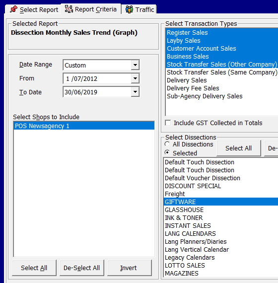
  1. Run your usual report in PosBrowser and save it as a PDF. Remember the name you saved the report under.
  2. Click on meta.ai.
  3. Please type the + in the box and upload your PDF into an AI assistant.
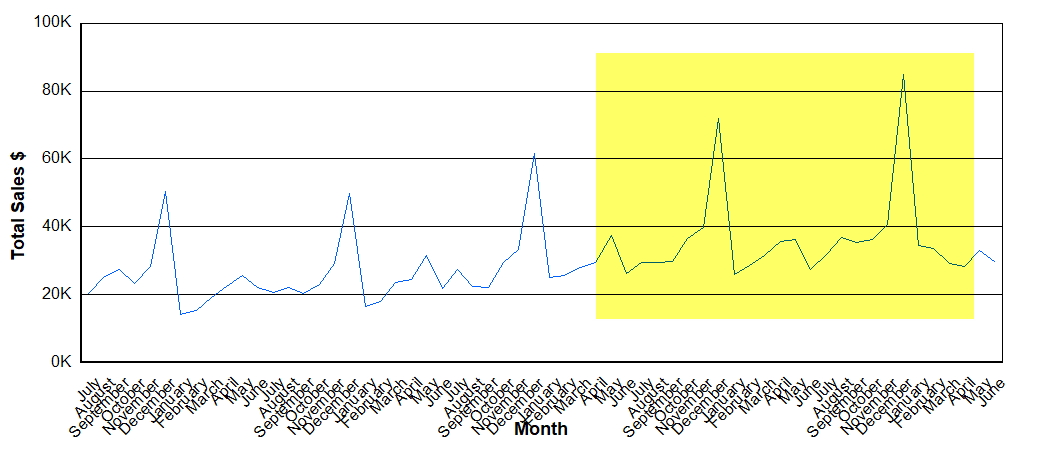
  4. Now ask the AI to produce a dashboard that shows the exact metrics you want, for example, if I printed out a report on stock sales by category, I might ask for a dashboard that shows the exact measures you need.


Create a stock valuation dashboard by department, top 20 categories, ageing stock, and sales trends over time.
 

Note: For this example, I specifically used Meta AI because it is currently free. Since most of my clients do not have paid AI accounts, I wanted to select a tool that is highly accessible to everyone. While you can use other AI platforms, Meta AI is a great starting point if you want to test this process without any extra cost.

How Do You Check an AI Dashboard Against the Original PosBrowser Report?

The AI can turn a text-heavy report into a cleaner visual summary within seconds or minutes, depending on the platform and file size. However, you must review the visual output against the original report before sharing it with staff or using it for decisions. AI does make mistakes.

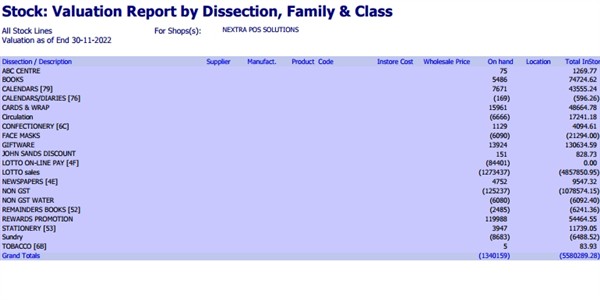
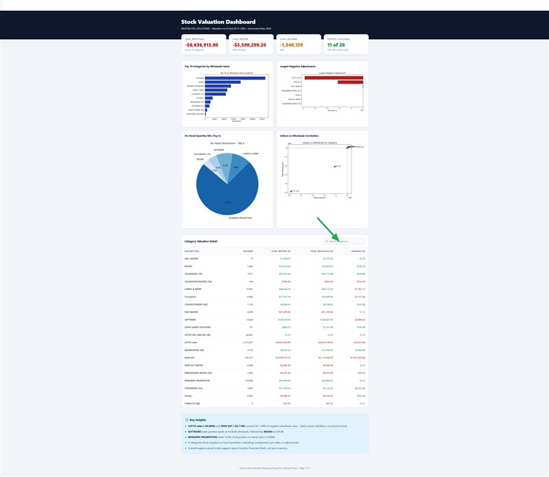
Below, you can see a sample stock valuation report beside the dashboard generated from the same data. The example below shows how a standard POS report became an AI dashboard.The green arrow is where you can add departments to examine.

Stock valuation report

Stock valuation dashboard

How to Proceed

I suggest starting off with a few reports you know well, such as a total report. Test how it goes and use this example to improve your requests.

Enjoy.

Written by:

Bernard Zimmermann


Bernard Zimmermann is the founding director of POS Solutions, a leading point-of-sale system company with 45 years of industry experience, now retired and seeking new opportunities. He consults with various organisations, from small businesses to large retailers and government institutions. Bernard is passionate about helping companies optimise their operations through innovative POS technology and enabling seamless customer experiences through effective software solutions.


Add new comment

Restricted HTML

  • Allowed HTML tags: <a href hreflang> <em> <strong> <cite> <blockquote cite> <code> <ul type> <ol start type> <li> <dl> <dt> <dd> <h2 id> <h3 id> <h4 id> <h5 id> <h6 id>
  • Lines and paragraphs break automatically.
  • Web page addresses and email addresses turn into links automatically.
CAPTCHA This question is for testing whether or not you are a human visitor and to prevent automated spam submissions. Image CAPTCHA
Enter the characters shown in the image.

Graph your sales results

POS SOFTWARE

One key to success in retail is monitoring sales trends. Imagine having a report for your business review that you can understand. This is where sales data visualization comes in.

The Power of Sales Data Visualization

As the Russian writer Ivan Turgenev wisely noted, "The drawing shows me at one glance what might be spread over ten pages in a book." This couldn't be truer when analysing your business's sales data.

Graphs offer a quick, clear snapshot of your sales trends. They help you:

  • Spot ups and downs at a glance
  • Identify long-term patterns
  • Assess the impact of your business strategies

Let's dive into how you can easily create and interpret these visual goldmines using a business POS system.

Benefits of Visualising Your Sales Data

  1. Decision-Making: You can quickly identify which products are your top performers.
  2. Inventory Management: It helps you to anticipate seasonal trends and stock accordingly.
  3. Better Sales Efficiency: It enables you to focus on what's working.
  4. Time-Saving: Get retail data insights in seconds instead of hours spent poring spreadsheets.

Creating Your Sales Graph: A Step-by-Step Guide

Step 1: Access Your Reports

  1. Go to Reports in your point of sale software
  2. Select Sales
  3. Choose Dissection Monthly Sales Trend (Graph)

Step 2: Set Your Parameters

To get a comprehensive view:

  1. Select an extended timeframe (Do not be afraid to use five years as even this can show much)
  2. Choose your product category (e.g., giftware)


There are many options here, but I will keep it quick and straightforward, and you can build up from there.

Pick a long time; I will pick seven years because I am looking at a long-term trend.

I decided to look at giftware products, so I picked selected and highlighted giftware.


What Can We Learn?

  1. Long-term growth: Sales have increased from $20K-$50K to $30K-$80K monthly.
  2. Seasonal patterns: Christmas peaks are noticeably higher in recent years.
  3. Overall trend: The upward trajectory suggests successful strategies are in place.

I am sure you will agree that it is much easier to see that than a report with lots of numbers.

The Power of Visual Data

Imagine trying to spot these trends in a report full of numbers. With a graph, these insights jump out at you, saving time and mental energy.

Tips and Tricks for Effective Graph Analysis

  1. Compare Year-on-Year: Overlay graphs from different years to spot seasonal patterns and growth.
  2. Zoom In and Out: Look at long-term trends and short-term fluctuations for a complete picture.
  3. Combine Categories: Look at group-related products to identify broader trends in your business.

Your Turn: Give It a Go!

Now that you've seen how easy and insightful graphing your sales can be, why not try it yourself? Here's a quick challenge:

  1. Graph your top-selling product category for the past year
  2. Look for any surprising trends or patterns
  3. Jot down three insights you've gained

Conclusion

Graphing your sales results is a powerful tool for understanding your business travel. By regularly doing these graphs, you'll be better equipped to make informed decisions and improve sales performance.

Ready to Transform Your Sales Analysis?

Try our point-of-sale software now and see how easy it can work for you and turn your sales data for success.

In the world of retail today, knowledge is power. With our POS system for businesses, you have that power.


How did you go with creating your first sales graph? We'd love to hear about your experience and any insights you uncovered. Comment below or contact our support team if you need help getting started.


Add new comment

Restricted HTML

  • Allowed HTML tags: <a href hreflang> <em> <strong> <cite> <blockquote cite> <code> <ul type> <ol start type> <li> <dl> <dt> <dd> <h2 id> <h3 id> <h4 id> <h5 id> <h6 id>
  • Lines and paragraphs break automatically.
  • Web page addresses and email addresses turn into links automatically.
CAPTCHA This question is for testing whether or not you are a human visitor and to prevent automated spam submissions. Image CAPTCHA
Enter the characters shown in the image.